The new MLS logo offers more than first appears. Did you know it has a crying Timbers fan on it?
Major League Soccer has spent untold thousands (millions?) of our hard-earned ticket money on artsy-pants New York design firms to come up with what? An empty shield with a kickstand that someone forgot to erase? Maybe the designer was too busy waiting in line for an iPhone 6 Plus? We, as fans, deserve to have a soccer ball on our crest because that’s the sport, guys! It’s not played on a blank piece of paper. This is the WORST.
Let me start again.
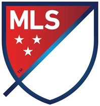
On the eve of its 20th anniversary, Major League Soccer has replaced the aging “foot kicks ball” logo design with something new and different. It’s not quite like other U.S. sports league logos, nor does it really resemble the symbols of other soccer leagues worldwide. It looks fine. Pretty boring, doesn’t do much for me, and reading the marketing speak telling me that the little nubbin is actually the end of an arrow plotting the course of the growing league into the endless blue skies or whatever has made me a little ill. Also, I don’t really care what the thing looks like. Why didn’t they go with this one? Or, this one?
…
Wow. Beautiful doesn’t even begin to explain this subtle and modern logo. Simple colorways, clean lines, sweet font…and did I mention the gradients? So much white space! It’s like nothing that’s ever been done, just like MLS. We are fans of a special butterfly of a league and anyone who doesn’t get this logo…well, they just don’t get ME, ok?
So, Major League Soccer has rebranded, and the early criticisms, positive and negative, naturally centered around the design itself. The internet being what it is, my examples above are probably pretty tame compared to reality.
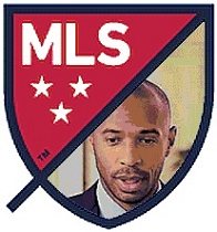
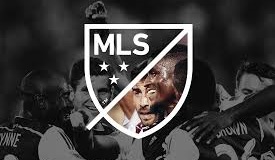
But talking about the image in a vacuum really misses the point. (Do what the three stars represent really matter? Did it matter when the NFL went from 25 meaningless stars on its crest to eight in 2008?) What became clear as soon as fans got this thing into photoshop (or even MS Paint) is that this crest is more of an invitation and a frame than a logo on its own, in the traditional sense of the word.
Also, as Graham Parker points out on ESPNFC, the adaptability of the design is key in a digital landscape where the brand has to cross from phone screen to TV, from print to t-shirts.
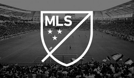
By that measure the new crest performs well, comes in more colors than your average iPhone, and generally has the potential to swoosh up and superimpose, under-impose or decompose to the satisfaction of editors and programmers everywhere. If it loses something in its ability to be all things to all people (and platforms), it’s at least true to another buzzword around the league, not mentioned today, but prominent in how MLS sees its own culture — it’s “nimble.” Not striking, but nimble.
This “container logo,” as the designer calls the basic shape [video], was made to be filled.
Not everyone cares about this as a marketing and branding move. It won’t affect the play on the field, likely won’t bring any superstars from overseas any faster than they were coming before. But from a fan’s perspective, the new logo is just fun to play with. In that sense, the league did something right here. Dozens of user-created versions here on Sounder at Heart and on a Reddit’s /r/MLS thread make that clear. But, lets leave the branding to the branders and the ads to the mad men and make awesome/stupid/funny team MLS crests!
Fill in the blank (logo)
by Jacob Sweeney-Samuelson
http://www.sounderatheart.com/2014/9/19/6562111/fill-in-the-blank-logo
The new MLS logo offers more than first appears. Did you know it has a crying Timbers fan on it?
Major League Soccer has spent untold thousands (millions?) of our hard-earned ticket money on artsy-pants New York design firms to come up with what? An empty shield with a kickstand that someone forgot to erase? Maybe the designer was too busy waiting in line for an iPhone 6 Plus? We, as fans, deserve to have a soccer ball on our crest because that’s the sport, guys! It’s not played on a blank piece of paper. This is the WORST.
Let me start again.
On the eve of its 20th anniversary, Major League Soccer has replaced the aging “foot kicks ball” logo design with something new and different. It’s not quite like other U.S. sports league logos, nor does it really resemble the symbols of other soccer leagues worldwide. It looks fine. Pretty boring, doesn’t do much for me, and reading the marketing speak telling me that the little nubbin is actually the end of an arrow plotting the course of the growing league into the endless blue skies or whatever has made me a little ill. Also, I don’t really care what the thing looks like. Why didn’t they go with this one? Or, this one?
…
Wow. Beautiful doesn’t even begin to explain this subtle and modern logo. Simple colorways, clean lines, sweet font…and did I mention the gradients? So much white space! It’s like nothing that’s ever been done, just like MLS. We are fans of a special butterfly of a league and anyone who doesn’t get this logo…well, they just don’t get ME, ok?
So, Major League Soccer has rebranded, and the early criticisms, positive and negative, naturally centered around the design itself. The internet being what it is, my examples above are probably pretty tame compared to reality.
But talking about the image in a vacuum really misses the point. (Do what the three stars represent really matter? Did it matter when the NFL went from 25 meaningless stars on its crest to eight in 2008?) What became clear as soon as fans got this thing into photoshop (or even MS Paint) is that this crest is more of an invitation and a frame than a logo on its own, in the traditional sense of the word.
Also, as Graham Parker points out on ESPNFC, the adaptability of the design is key in a digital landscape where the brand has to cross from phone screen to TV, from print to t-shirts.
By that measure the new crest performs well, comes in more colors than your average iPhone, and generally has the potential to swoosh up and superimpose, under-impose or decompose to the satisfaction of editors and programmers everywhere. If it loses something in its ability to be all things to all people (and platforms), it’s at least true to another buzzword around the league, not mentioned today, but prominent in how MLS sees its own culture — it’s “nimble.” Not striking, but nimble.
This “container logo,” as the designer calls the basic shape [video], was made to be filled.
Not everyone cares about this as a marketing and branding move. It won’t affect the play on the field, likely won’t bring any superstars from overseas any faster than they were coming before. But from a fan’s perspective, the new logo is just fun to play with. In that sense, the league did something right here. Dozens of user-created versions here on Sounder at Heart and on a Reddit’s /r/MLS thread make that clear. But, lets leave the branding to the branders and the ads to the mad men and make awesome/stupid/funny team MLS crests!