Although developments on the political front were certainly dispiriting, for the first time in years, the economic news was not all gloomy. But with the economy improving, there was less focus on the continuing need to address flagging incomes, rising inequality and unbalanced government spending. Below are 10 charts to illustrate the crosscurrents of the past year in economics and politics: (chart)
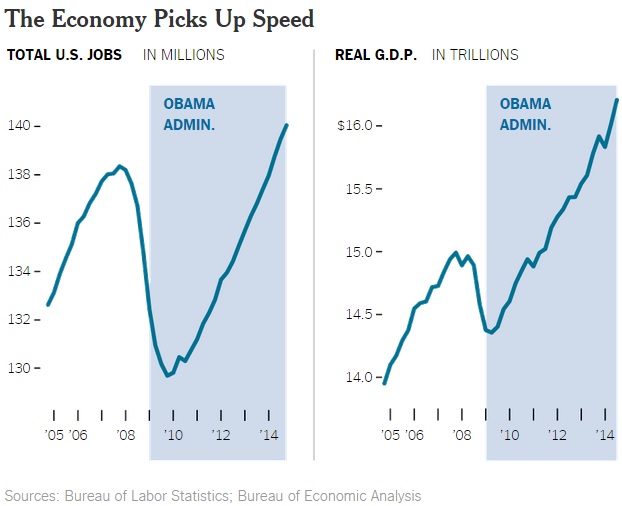
By the end of 2014, even the most hardened cynics had to concede that the darkness that had pervaded the American economy since 2008 had lifted a bit. Most visibly, the rate of job growth accelerated, from 194,000 per month in 2013 to 241,000 per month in 2014. By May 2014, the total number of jobs had run past its previous peak in early 2008. Meanwhile, the overall economy began to expand at faster annual rates — 4.6 percent in the second quarter and a remarkable 5.0 percent in the third quarter. (chart)
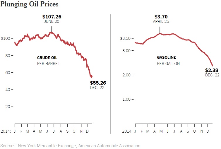
An autumn collapse in oil prices brought more good news. A barrel of oil that fetched $107 in June commanded only $55 by Dec. 22. For consumers, that meant gasoline prices that fell to an average $2.38 per gallon, compared with their peak of $3.70 in April. All told, the drop in oil prices was equivalent to an annual tax cut of about $750 per American family. And with the United States still importing an estimated 26 percent of its petroleum, lower prices raise the economy’s growth rate and reduce the balance of payments deficit.
The Year in Charts
How economics and politics unfolded in 2014, as told in 10 graphics.
by Steven Rattner
http://www.nytimes.com/2014/12/31/opinion/the-year-in-charts.html?ref=opinion
Although developments on the political front were certainly dispiriting, for the first time in years, the economic news was not all gloomy. But with the economy improving, there was less focus on the continuing need to address flagging incomes, rising inequality and unbalanced government spending. Below are 10 charts to illustrate the crosscurrents of the past year in economics and politics: (chart)
By the end of 2014, even the most hardened cynics had to concede that the darkness that had pervaded the American economy since 2008 had lifted a bit. Most visibly, the rate of job growth accelerated, from 194,000 per month in 2013 to 241,000 per month in 2014. By May 2014, the total number of jobs had run past its previous peak in early 2008. Meanwhile, the overall economy began to expand at faster annual rates — 4.6 percent in the second quarter and a remarkable 5.0 percent in the third quarter. (chart)
An autumn collapse in oil prices brought more good news. A barrel of oil that fetched $107 in June commanded only $55 by Dec. 22. For consumers, that meant gasoline prices that fell to an average $2.38 per gallon, compared with their peak of $3.70 in April. All told, the drop in oil prices was equivalent to an annual tax cut of about $750 per American family. And with the United States still importing an estimated 26 percent of its petroleum, lower prices raise the economy’s growth rate and reduce the balance of payments deficit.
…